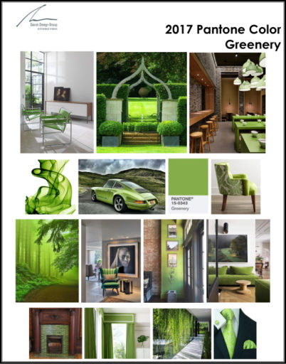
According to the Pantone Color Institute, Greenery is defined as a “refreshing and revitalizing shade, symbolic of new beginnings”. With a continued trend towards brighter and bolder accent colors, Greenery, reminds us of Springtime when nature begins to revive, restore, and renew. We asked Richard Gacek, owner and principal designer at Gacek Design Group, how he would use the Color of the Year in interior design projects. “As an accent color for a fireplace surround, glass front kitchen cabinets, or for welting on a sofa, for example”, said Gacek. “A classic and timeliness design should always concentrate on a neutral foundation, and be mindful of bringing the outdoor views to the inside, with distinct accents”.
From Richard’s Studio
Shades of Yellow
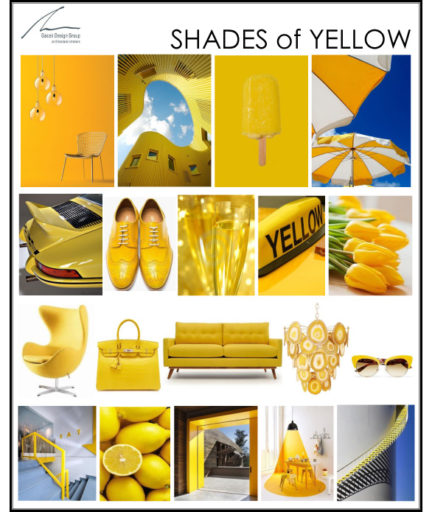
Summertime inspires Shades of sunshine Yellow…According to the Pantone Color Institute, the human eye can see the color yellow better than any other color. Shades of yellow in an interior design can convey different emotions. A bright yellow increases energy and encourages innovation, whereas a light yellow color brings warmth and softness to a room. Inspired?
View our Pinterest Board!
gacekdesign.com
Happy 4th of July 2016
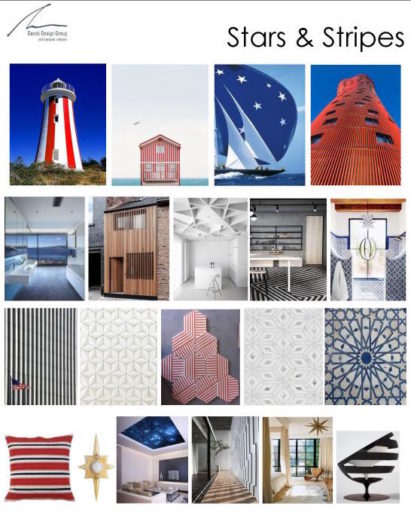 As we celebrate July 4th and the independence it represents, we are inspired by our American flag, a statement of freedom and a symbol of American values. Our design board visualizes architectural details that highlight stars and stripes in many unique ways.
Inspired? Click on Learn More and view our Pinterest board.
Happy Memorial Day 2016
Memorial Day reminds us of the sacrifices that the men and women of the Armed Services make to defend our way of life. Be inspired by our country’s colors of red, white, and blue!
From-Richards-Studio-Red-White-BlueCelebrate Earth Day
Shades of Green
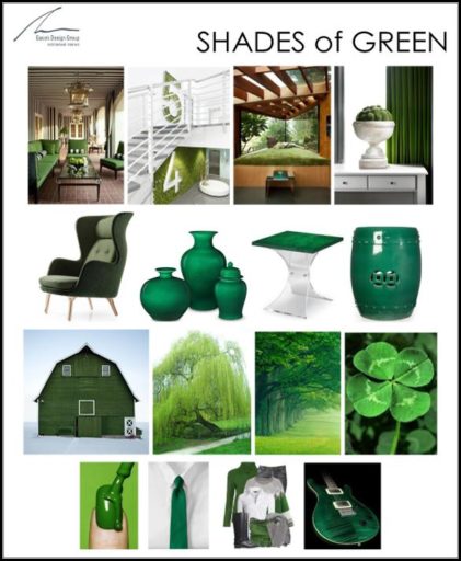 Spring is a time of rebirth, regrowth, and rejuvenation. We are inspired by the shades of green found in nature at this time of year. Green as an accent color works well in a neutral interior palette. We would bring out the color in accessories or a special upholstered furniture piece.
Inspired? Click on Learn More and view our Pinterest board.

 Welcome to “From Richard’s Studio”, a place for Richard and the team to share our design knowledge and ideas. Those trends, styles, and special features that are meaningful and inspire us to create classic and timeless interior designs. We believe good interior design evokes an emotional response. We create these experiences with research, expertise, and inspiration. We hope that our design tips offer inspiration for your home!